Wednesday, December 31, 2008

Happy New Year!

Happy New Year!
This is a piece I painted last February as a part of a four painting series of wine paintings. You can see the others on my website in the Still Life Section of my gallery.
http://watercolorworksart.com/StillLife.htm
Stay well and safe and have a healthy and prosperous new year. Thanks so much for visiting!

Thursday, December 25, 2008

Merry Christmas


Merry Christmas!
May God bless you this Christmas season and throughout the New Year!


Debbie Johnson
Watercolor Works

http://watercolorworksart.com

Tuesday, December 23, 2008

The Final Apple and Napkin Study in Watercolor

Here is the final painting! I went over many areas with some subtle washes to define and refine.
This piece is posted on my etsy shop for sale, if you are interested.
http://watercolorgirl.etsy.com

Thanks for visiting

Hope you have a Wonderful Christmas!
Link

Almost Done Apple Study in Watercolor

Now I have added a wash onto the apple. I used a slightly damp kitchen sponge to soften the white areas of the apple. After allowing that to dry, I applied another wet wash of Permanent Rose to tie the apple into one unit. I also, after the apple was dry, used VanDyke Brown and French Ultramarine Blue to add the details to shadow areas in the stem and shadow at the bottom of the apple.
I used these colors throughout, to deepen the shadows and refine the piece.

More Apple Still Life...

I have added another glaze of French Ultramarine Blue onto the napkin. Each glaze creates a different value. Keeping the glazes wet and transparent adds to the eventual depth in the color.

Monday, December 22, 2008

Adding Shadows to the Apple Still Life

Prussian Blue is used here in some of the shadow areas on the napkin, around the apple and in the shadow on the table under the napkin.
Other colors that work well are Pthalo Blue and Indigo. Be careful with these colors, however, because they are very intense, dark and staining. Staining colors don't lift well, if you decide later that the application was too dark. So use lots of water and apply these colors frugally.

Apple Still Life in Watercolor

I have added some Permanent Alizarin Crimson to the apple and napkin. Alizarin Crimson is a cool red, so it works especially well in the shadow areas.
I have glazed the red over the blue in a small area of the napkin to the right of the apple. I will do more glazing on the napkin soon.

Friday, December 19, 2008

Apple Study in Watercolor Continued

The technique used for the top of the flower pot is again used in the bottom of the flower pot. I have dropped VanDyke Brown into the very wet wash again to create shadow areas. This technique also helps to create the organic-look of water stains. On the left center of the pot I added a little water back into the damp wash to create a "bloom".
I think one of the toughest things for people who are just learning watercolor is to use enough water. There is a reason why it is called WATERcolor. The primary ingredient in your application will be water. Of course, you will add various amounts of pigment to the water, but the most important element is water. Sometimes you will apply very wet paint to dry paper, and sometimes you will wet the paper first, then add some less wet pigment - but water is what keeps your washes smooth, controls texture (or lack of texture) and controls the value of the color on your paper. Paint that is applied too dry will lose it's vibrancy and freshness. It will look dull and dead. So, remember - water, water, and more water.
An excellent book on this topic is: Mastering Atmosphere & Mood in Watercolor, by Joseph Zbukvic, available through Northlight books. Beautiful artwork and a very clear description of how to use different water to pigment ratios.

Thursday, December 18, 2008

Painting the Flower Pot in the Apple Study

For this installment of the apple and napkin study, I want to get a glaze of color on the flower pot. I have mixed a very wet puddle on my palette of Burnt Sienna, VanDyke Brown and Quinicridone Gold. I applied this wash to the top of the flower pot and then, while the glaze was still wet, I applied some of the individual colors directly into the wash, in a wet-in-wet style. I used VanDyke Brown to emphasize the shadows directly under the leaves, being sure to apply it only to one side of the leaf to indicate a shadow. Remember, the light will usually be stronger from one direction, which will cast shadows in the opposite direction.
I like adding the colors directly into the wash when creating a flower pot because it replicates the various rust and water marks that usually exist on the clay pot.
This glaze must dry before I apply the next wash onto the bottom of the pot. A hair dryer works well to dry the wash if you are in a hurry to move on to the next step.

Wednesday, December 17, 2008

Another Installment on the Apple Study

Using both Hookers Green and Sap Green I have added some very simple shadow work to the leaf area. This area is not the focal point, so I have to work hard to keep it simple and loose. Because I just love those details I have a really hard time not going in there and painting every stem and vein.
To strengthen the values in the shadow areas of leaves there are some nice tricks with color you can use. One, use a cool blue wash (either French Ultramarine or Pthalo or Prussian), keeping the wash wet so it remains transparent. Another way to deepen shadow areas is to use a color that is opposite on the color wheel. So, in the case of green leaves, adding a cool red, like Permanent Alizarin Crimson, will greatly intensify the values. I have also used VanDyke Brown for this type of application, but it is a very grainy color, so if you want to wash to look clean and clear, use Alizarin instead. Keep these washes wet and transparent to keep the most life in your colors. Pigments that are applied too thick will look dull and lifeless.

Tuesday, December 16, 2008

Apple Study in Watercolor Continued

It's time to add a wash of color to the background! I mixed some Indigo, with a little French Ultramarine Blue and a touch of VanDyke Brown. I started with a number 10 round brush and worked from the leaf area out toward the right edge of the paper. Once I worked around the leaves, I quickly picked up my one inch flat brush and completed the flat wash. I tried not to brush an area more than once. I applied a "row" of paint, then scooped up more pigment and just barely touched the brush to the already wet area, as I applied it to the next "row".

After completing the right side, I turned my paper around and used the same procedure to finish the left side. Remember that it's fine (and sometimes beneficial!) to turn your board as you go. Especially when working with large, wet washes, it is a good idea to allow gravity to move the paint around the wet area. It eliminates some of the brushwork, and helps the pigment to flow evenly. Notice that the value of the paint lightened quite a bit after drying!

On another note, as the holidays are quickly speeding by, I am planning to get my teaching schedule organized and I will be posting upcoming classes and workshops soon. If you are interested, please visit my website: http://watercolorworksart.com/Classes.

Monday, December 15, 2008

Apple Study in Watercolor Continued

For this section of the painting I have added a medium wash in French Ultramarine Blue to the napkin. The napkin is plaid, so I will have several washes to glaze on to make the total effect. I used a very wet wash and the puddles actually help to glaze shadow and texture in this wash. I used darker values behind the apple and on the edges of folds.

It's good to squint your eyes to better see the values in your reference photos.

Saturday, December 13, 2008

How To Paint Trees Booklet Available

I have recently updated my How To Paint Trees in Watercolor Booklet. It is chock full of techniques, step-by-step instructions and photos for painting trees in watercolor. You can now purchase this little gem on my etsy webstore. If it's sold, just send me an email and I will post it again! You can either have it shipped as a booklet or you can have it sent to you as a pdf file and print it yourself.
http://watercolorgirl.etsy.com

Apple Study in Watercolor Number Three

The table now has the first glaze of color. I will add more details later. As I move around the painting I have decided to add a very wet wash of Aureolin Yellow and Sap green to the leaves on the plant at the top of the painting. Again, for my underpainting I have used a wet-in-wet wash. The blending of colors gives a lime-green look to the leaves. I dropped in the Sap Green in areas where I wanted to create the soft illusion of shadows. Later I will add more detail to this, but for now I am happy with the wash.
The painting is beginning to lose it's "flat" look. When painting realism, it's important to use the lights and shadows as a guide for how and where to apply the paint. I start out rather loose, then add details onto that foundation of color and value.
Check back soon for another update on this painting!
For more images of my work, please visit my website: http://watercolorworksart.com

Friday, December 12, 2008

Apple Study in Watercolor Number Two

For this painting, I want to create a wooden table for the foundation. The first thing I do is wet the entire table area with lots of water. The water will keep the pigment edges soft and will allow any additional color I add to blend. Lots of water is required for this stage so the paper will stay moist and provide time to work. Keep the other areas of the image dry. For instance, I painted the clear water AROUND the apple and napkin.

Now I add a solution of Burnt Sienna and Brown Madder. This should be relatively wet, yet strong enough to see some color. It will become quite diluted as it is added to the very wet paper, and therefore lighten quite a bit as it dries. I continually tip and roll the board so the colors move about on the wet surface.

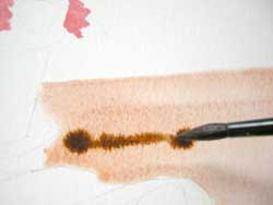
Now, while this mixture is still wet, working quickly, I use my Number 12 Round Brush to add a fairly strong, yet wet solution of VanDyke Brown. I don't want this to totally blend in. I just want softened edges. This will provide a foundation for the look of wood grain on the table. I apply this mixture in "V" shapes to replicate the shades of the grainy wood.


This procedure is continued with the same colors until I like the look. It is important not to scrub the paint brush on the paper at this stage. I just want to use the brush to push the puddles around and to drop wet paint onto the wet surface.
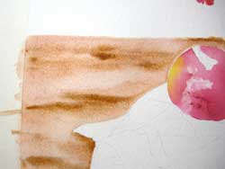
The more the board it tipped and tilted, the more the colors will blend and soften. Gravity and water will do a lot of work for you if you put the brush down and tip the board/paper around! It's lots of fun. The area that was wet initially will keep the paint from running further as long as the paper isn't tipped so drastically that the puddles run beyond those areas painted with water. (Hope this makes sense!)

More to come on this painting this weekend. Stay tuned.


Thursday, December 11, 2008

Apple Study in Watercolor

I have a new painting in progress and I wanted to share it with you. I used two different photo references for this piece, both taken from my own "stuff". One photo references the apple, napkin, and the bottom of the flower pot. The other photo was my reference for the flowers in the container. I want to make the apple and the napkin the focal point. I would like to keep the composition very simple.
The drawing is transferred onto the paper using a graphite stick on the back of my drawing. Then I tape the 300 lb. Kilimanjaro paper to a foam core board. It's important to be sure at least 1/2 inch of tape covers the paper so that when it gets wet it doesn't lift the tape and curl the paper.
I washed water over the image of the apple, leaving the areas I want to keep white dry. As I flow pigments into the water, I work to avoid the dry areas so the whites will stay crisp and clean. I use Permanent Rose, Permanent Alizarin Crimson and Aureolin Yellow with only a little water. I don't need much water because the colors will be diluted in the water that I have already applied to the paper to control the wash area.
I have used Permanent Rose and Cadmium Red for the flower petals. And I applied them in a wet manner so the colors run together a little.
More coming soon on this piece. You can follow this blog by clicking on the icon at the left of the page.
More on my artwork : http://watercolorworksart.com

Monday, December 8, 2008

Finished Painting - Geranium in Watercolor!

The finished painting!
To view more of my flower paintings (and other pieces in a variety of topics) visit my website: http://watercolorworksart.com/gallery1.htm.
I'll have to get busy this week and start another painting and I will take photos along the way to show you, once again, how I build a painting.
My classes are set up such that I bring in a drawing and photo reference, and paint with my students. I demonstrate every step of the process so each student can learn how to develop a watercolor painting, and begin to have their own style, once they learn the process. We have lots of fun. Hope you can join us. I also have workshops about once a month. You can register online!
http://watercolorworksart.com/Classes.

Sunday, December 7, 2008

Red Geranium Nearly Complete

I am just tweaking areas that can use depth. I continue to use the same colors used previously to glaze little washes throughout the painting. Each glaze, whether in the same color or a different color, will enhance the values and intensify the colors. Using subtle variations of soft and hard edges also adds depth and realism to the piece.
My next post should be of the final piece.
Thanks for visiting!

To learn about my classes and workshops please visit my website: http://watercolorworksart.com/Classes

Saturday, December 6, 2008

Painting a Red Geranium - No. Five

At this stage of the painting I have continued to add Burnt Sienna to areas of shadow in the stems, leaves and shadow areas. I have also used Hooker's Green to develop some of the shading in the lower leaves. Notice that I have used both hard and soft edges. To soften an edge I apply the green, then use plain water with a damp brush to touch the edge of the still wet paint. The pigment flows into the wet area and the edge softens. It's important to pull the water from the dry area into the wet pigment. If I pulled the water from the pigment out, I may cause a bloom, or I would just continue to pull the pigment out and still have a funny edge where the pigment dried.
I used Perelyne Maroon and Rose Dore to glaze the flower in subtle wet washes. I use different colors to glaze the petals that are facing different directions to give the illusion of light reflecting in different directions.
More to come soon!

Thursday, December 4, 2008

Red Geranium Painting Installment No. Four

This particular geranium had a beautiful dark variegation on the outside of the leaves. This was added with a brush-dance type of stroke (holding the brush straight up and down and using the point of the brush only), using a number 10 round brush with a good point and natural hair. I used Burnt Sienna for the color and I used it very wet. The water is what gives the variation in the values of the pigment. I painted this very wet onto the dry surface of the leaf.
I also used the Burnt Sienna to create some tiny details in the shadows of the flower petals. This piece is moving along quickly!

Wednesday, December 3, 2008

Red Geranium Painting Installment No. Three

I have added a very wet, Sap Green wash to the leaf area. As I come close to the red bud at the bottom, I allowed the green to come over the red a very tiny bit to create a shadow where the green leaves surround the petal. I added small touches of Hooker's Green in some of the shadow areas to intensify the value. I allowed some water to spill into the bottom of the large clump of leaves in the center. I think the underpainting, when glazing like this, should have some variations in value and tone to add subtle depth and interest to the subsequent glazes.
Keeping the glazes light and transparent gives me the control I like, and prevents me from getting too dark or opaque with the colors too quickly.
I still have room in my Friday morning Beginner's Watercolor Class. If you would like to know more about my classes and workshops, please click here to visit my website.

Tuesday, December 2, 2008

Red Geranium Painting Installment No. Two

This is the second installment of How to Paint a Red Geranium.
At this stage of the painting I have used a cool red, Alizarin Crimson, to paint some cool shadow areas in the flower petals. The value (lightness or darkness) of the shadow areas is important. If it is too light the painting will look pale and washed-out. If the value is too dark, too soon, subsequent glazes will just look dull instead of transparent.
I have also used a very wet, thinned wash of Scarlet Lake to brighten and enhance some of the warmer petals. I don't plan to do a background wash for this painting, so I am leaving it alone and concentrating on the flower and leaves.
It's important to use a variety of edges, both crisp and soft. Check back for the next installment, hopefully tomorrow!

Monday, December 1, 2008

Red Geranium in Watercolor Process

A few posts ago I showed a red geranium painting that I did with my students. I thought it would be fun to show you how that painting was developed.
First, a drawing was done from a photo I took of a geranium in a flower pot in my back yard. I greatly simplified the picture by leaving out the background and only focusing on one stem of petals with corresponding leaves.
After applying the drawing to my watercolor paper I have applied the first wash with Winsor Red, a Winsor Newton color. I used a varied wash with light and dark values to provide a foundation of color on which to layer future glazes. I will post the next stage of this painting soon.
Classes are starting this week, but I am always open to new students anytime. Stop by my website to see the schedule - you can register online! Click here for class information.

Saturday, November 29, 2008

Watercolor Classes Begin This Week

My watercolor classes begin this week in Melbourne, Florida! I taught for several years in the Metro Detroit area of Michigan. Since we have moved it has taken a little time to get my classes going, but things are falling into place. Classes are still small right now. From my experience in the past I know they will grow. This is a good time to get in a class with a small number of students.
The photo here is of a past student in one of my Friday Morning Drop-In classes that I held in Michigan. We were working on a very large still life painting. Jim always did such beautiful work!
If you would like to know more about my watercolor and drawing classes you can get more information and even register online at: http://watercolorworksart.com/classes. Hope to see you soon.

Sunday, November 23, 2008

Bird of Paradise Watercolor Completed

The final painting! I added another wash of Prussian Blue to the background to cool down the purple. I am happy with the piece and it is now showing at the Silken Galleria, 912 E. New Haven Avenue, Melbourne. There will be no prints of this piece. If you are interested in purchasing it, you can contact Elizabeth at Silken by calling 321-733-2788.

Friday, November 21, 2008

Bird of Paradise Painting - Almost Complete

The latest installment!!! I'm almost done! I have added one final glaze on the background leaves and I also did a little "tweaking" on the values of the flower head. I'm not totally crazy about the background yet. I think it needs something subtle, it looks a little too purple. I went through the image with a fine tooth comb to see if there were any areas that looked too unfinished. That technical illustrator in me is coming out, I'm afraid. I really like my paintings to look as good close up as they do from a distance. I have added a touch of Prussian Blue to the green leaf just above the yellow flower elements to create contrast and punch the yellow just a bit more. Next installment should be the final painting! Stay tuned. To find out more about my classes and most recent work, please visit my website: http://watercolorworksart.com.

Thursday, November 20, 2008

Bird of Paradise Painting Progress

I decided to add a glaze of Ultramarine Violet to intensify the background. I chose the purple color to contrast with the yellow and gold of the flower focal point. I have also added another glaze to many of the green leaves. Each glaze intensifies the color without making the image muddy.
Next, I added some Alizarin Crimson to the shadow areas of the flower, including the green area at the base of the flower head. The combination of green and cool red glazes really darkens and warms the value of the shadows. Alizarin Crimson is a cool red and works great in shadow areas of both warm and cool areas.

Wednesday, November 19, 2008

More on the Bird of Paradise Painting in Progress

I have now added the greens to the flower base. I want to make the flower more of the focal point, so to do that I have to intensify the different values between the yellows, greens and blues of the flower with the blues and lavenders of the background.


Here, I have added yellow glazes to the flower and I have added some green glazes to the leaves. I used Quinicridone gold for the yellow wash, and Hooker's green for the greens. I also added some Quinicridone gold to some of the leaves to warm then up. This helps to separate them more from the cool background.
More to come...

Tuesday, November 18, 2008

Flower Painting Installment 4

Here is another installment on the progress of my Bird of Paradise painting.
I have continued to add glazes around the entire painting. Here I have begun to add more yellow and gold glazes on the actual flower. I used Quinicridone Gold, which I think is a beautiful, transparent alternative to Yellow Ochre. Yellow Ochre tends to be more opaque and, when used as a glaze, appears cloudy or dull. Quinicridone Gold is very transparent and adds a delicious glow to the yellows. This glaze was added fairly wet so that it is built up gradually. I added it to a few of the green leaves, as well, to warm those areas.

Monday, November 17, 2008

Painting in Progress: Installment 3

I am still working on the Bird of Paradise painting. I am now beginning to work with the second set of glazes. Note the second leaf from the left that comes up from the bottom edge of the picture plane. I had previously created some shading with other colors, including French Ultramarine Blue. Now I have added a glaze of Perylene Green, very wet. As different colors are glazed on top of one another, after the first layer has thoroughly dried, deep rich colors emerge!


Now, I continue to glaze colors around the entire painting. Many times I will work with only one color where it is needed around the entire painting before I move on to another color. I am also adding yellow glazes over some of the greens, and a very wet Prussian Blue over other areas to push the warm areas and cool areas.


At this stage, I want to be sure I am not totally ignoring an area of the painting that may not be as exciting or interesting to me as others. I love this stage as the glazes make the painting seem to begin to come to life!

More to come. Visit soon to see the next stage - and soon, the final piece!

More information on my website: http://watercolorworksart.com.

Sunday, November 16, 2008

Painting in Progress: Bird of Paradise

Today's installment of the painting process is to show that I have added a wash on the main focal point of the flower in browns and reds. Using burnt sienna, I have also added some small areas where the leaves have died off. I often add the dead or decaying areas of plants in my paintings because, to me, that is part of the beauty of the plant. It also adds warmth to the green/cool areas.


The next stage is to begin adding more greens and blues to the leaves. I believe it's important to continually work around the painting, so that one area doesn't get over developed while another area is totally undeveloped. I am enjoying the rhythms and directional lines that are developing within this composition. I am also thinking about how to develop the greens and blues of the leaves, altering warm and cool colors, so that I can maintain the integrity of the focal point, which is the beautiful, bird-like flower.


Here I am underglazing some of the details in the green leaves. These underglazes will work together with future glazes to build rich colors and to create beautiful, interesting textures in the final piece. I have used viridian green, Hooker's green and a very watered-down Prussian blue for these glazes.
More to come soon!

For more information on my work, please visit my website: http://watercolorworksart.com, where you can see my latest paintings, class information and more.

Friday, November 14, 2008

Bird of Paradise Painting Progress 1

Okay, here are the first few photos of my Bird of Paradise painting in progress. The initial photo shows the drawing which was transferred onto the Arches 300 lb watercolor paper with graphite. I added the first wash of Aurolean yellow, a touch of New Gamboge, and a tiny bit of Cadmium Orange. I also began a small wash on the leaf with some Cerulean blue, very wet.


The second photo shows a bit more wash on the leaves. I have added the yellows (mentioned above) on the lighter areas and more Cerulean blue on the bluish leaves. As I study my reference photos (always use your own photos!!!!!!!), I noticed lots of variations of blues, greens, yellows, gold and brown on the leaves. In order to make the painting look as real as possible, I use glazes of various colors to achieve the delicate and varied colors I want to produce.


The third photos shows the beginning of my background. I used a very wet wash of my favorite, French Ultramarine Blue and Ultramarine Violet. I am hoping these colors will produce a nice underglaze which will contrast with the warmer colors of the flower and the leaves.

Stop back by soon to see more progress. I will try to update soon!

You can view another painting in progress on my website at: http://watercolorworksart.com/simpleviewer/index

Teaching Watercolor in Melbourne, FL

The photo at right shows three of my students from Michigan. You can see they were painting from the same reference photo, but each piece reflects their style, personality and palette choices! It is so much fun to see the individuality come out in my student's work!
I am now forming classes in my new hometown of Melbourne, Florida and I have a Beginner's Watercolor Workshop planned for November 22. The workshop is on Saturday from 9 a.m to 3 p.m. We will set up our palette, discuss quality materials, learn the four basic washes, practice essential brushwork and put together a small painting. If you are interested in my classes, workshops or would like to view my other work, please visit my website. You can now register for my classes and workshops online at:
http://watercolorworksart.com/Classes.htm - Below the schedule of classes you can click on the link for online registration.
Currently, in my personal work I am working on a painting of a Bird of Paradise flower. I have been taking progress photos of the piece. Keep watching to see some of the progress in the next few posts.

Thursday, November 13, 2008

Violets with Dew Drops Watercolor

I absolutely love to paint flowers! This was a demonstration piece for one of my watercolor classes. The reference photo was from a flower in my garden early in the morning.
The secret to water droplets is to treat them like little balls or clumps and paint the shadow shapes. They reflect more than they are transparent, so some of the surrounding colors will be reflected in the high lights and shadow areas. The lavenders and purples were built up using glazes of French Ultramarine Blue, Quinicridone Magenta and Perylene Maroon. I had to soften the pigments with water at the edges of the petals as the color came to the center of the flower.
Violets have such character! It is almost as if they have faces.
If you would like to see more of my work, or learn about my classes in Melbourne, Florida, please visit my website: http://watercolorworksart.com

Tuesday, November 11, 2008

Veterans Day From Watercolor Works

My father was in the navy. My brother was in the navy. My son was a marine. Thanks to all those who have served our country. Freedom comes at a cost. The price you have paid is appreciated!
Thank you!

Red Geranium In Watercolor

I love flowers! Here in Florida the annual plants are coming out and blossoming everywhere. This little piece is a study I did in one of my past Friday morning classes. We started by using graphite to transfer a little drawing that I did onto some Arches 140 lb. watercolor paper - 10 x 14 inches. Then we began light washes of pinks, reds and greens to develop the petals and leaves. Each layer, or glaze, must be allowed to dry before applying the next if you want to develop crisp lines. Other areas were worked a little wet-in-wet. Pigment is added to a damp or wet area so that the edges of the colors soften and float into one another. The brown in the leaves was created by adding some burst sienna after the greens were completely dry. I let my brush dance over the area with a wet pigment, then dabbed at the moist areas here and there with a damp brush to lift and soften in a few places.
I really enjoy the play and interaction between the very soft bristle brushes and the pigments. This was a very fun study to work on. I think my students enjoyed it as well.
For more information on my artwork and classes, visit my website at: http://watercolorworksart.com.

Monday, November 3, 2008

Sharing a Student's Work

This is Adeline, one of my past students. This is her rendition of a piece we worked on in class. I thought it was really lovely. She did such a great job of adding to the reference her own personality by adding more leaves and buds and softening the edges! She had a nice balance of lights and darks and there is movement created in the piece due to her linework and placement of leaves and focal point.
Great job Adeline!!!